Despite being a foundation for music, music theory is often viewed as boring or abstract, especially for younger audiences. That’s where Noteful comes in: a startup aiming to make music theory fun. In this project, my team and I tackle the redesign of Noteful's experience and interface for an engaging, long-term learning journey through gamification.
Original Prompt
Design an engaging dashboard to keep students motivated long-term.
For my senior HCI capstone project, my team partnered with Noteful. When we first got onboarded, they requested a revamp of their beta student dashboard ahead of their official launch — mostly UI improvements that would appeal to their audience of young kids.
Over four months, we redesigned Noteful's UX/UI, focusing on both strategy and execution across the product lifecycle:
Defined product strategy
Identified user needs, learning goals, and engagement opportunities through research.
Explored & validated ideas
Rapidly iterated on low- to high-fidelity prototypes to test flows and gamification interactions.
Designed for long-term
Developed systems for progression, motivation, and feedback that support sustained learning over time.
Solution
A gamified, learner-centered experience that makes music theory engaging, approachable, and sustainable for young learners.
Research
So... why was the app needed in the first place?
Since this is also completed as a capstone project, time had to be dedicated to research. Before starting the redesign, I brainstormed and executed with my team 3 different forms of research to gather more insights and familiarize ourselves with the music theory e-learning scene, including:
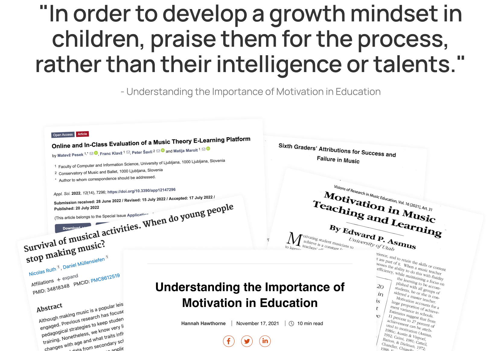
Literature review
of what is relevant to extrinsic/intrinsic motivation and e-learning.
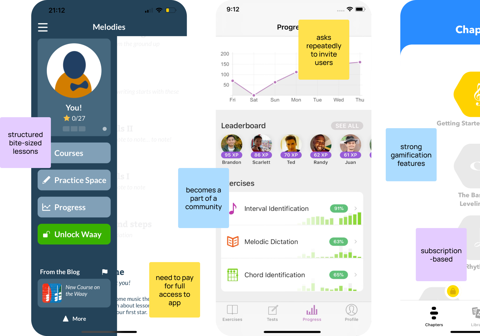
Competitive Analysis
of popular e-learning apps, some specific to music, currently on the market.
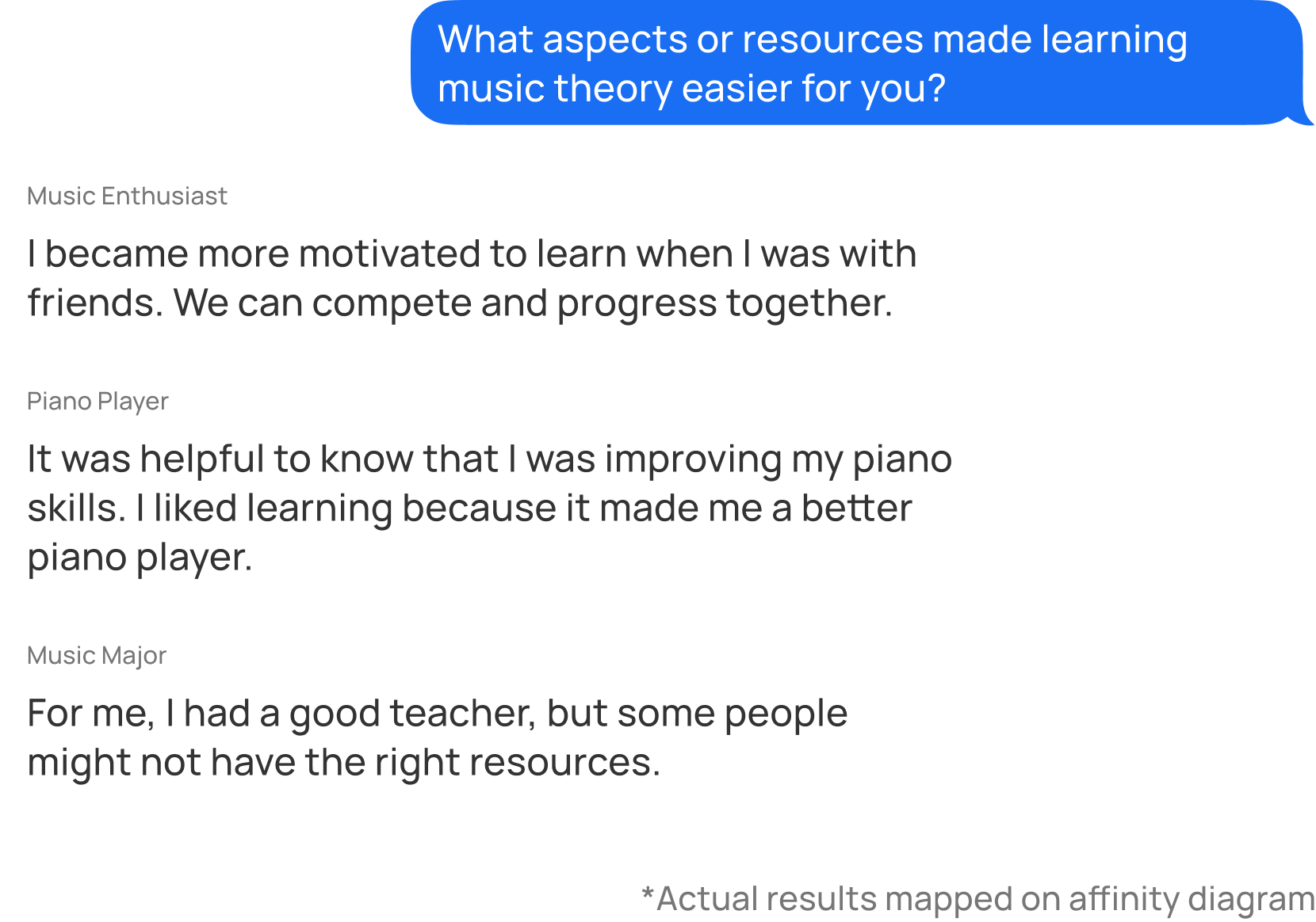
User interviews
with long-term music theory learners to hear firsthand experiences.
Research Insight
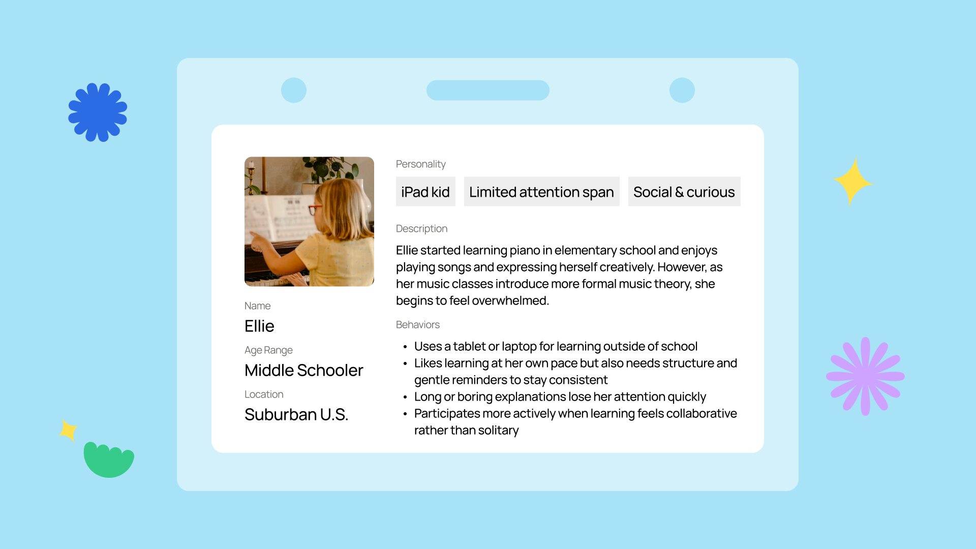
For young learners, traditional music theory learning comes off as monotonous and unengaging.
Music theory is often taught alongside instruments like the piano, but unlike playing music, theory can feel monotonous and disconnected. Traditional worksheets and apps aren’t designed with kids in mind, leaving young learners wanting something more fun, and shared with friends.
These insights got us thinking: How can Noteful's dashboard fill in the gaps where current learning methods are falling short?
Conceptualize
How can Noteful come fill in gaps in the music theory learning space?
Brainstorming jam
Our team first brainstormed together on how Noteful could improve student engagement through a dashboard, grounding our ideas on the concepts of intrinsic and extrinsic motivation through gamification.
Speed-dating with storyboards
We then tested the ideas through storyboards. For example, this storyboard was one that was particularly well-received, informing us to create some sort of competition within the Noteful community.
Initial Sketches
Testing a feature's presentation and its perceived effectiveness.
I next suggested we sketched feature ideas, highlighting how presentation affects effectiveness. Afterwards, we ran quick think-aloud interviews for feedback on layout, navigation, and visuals.
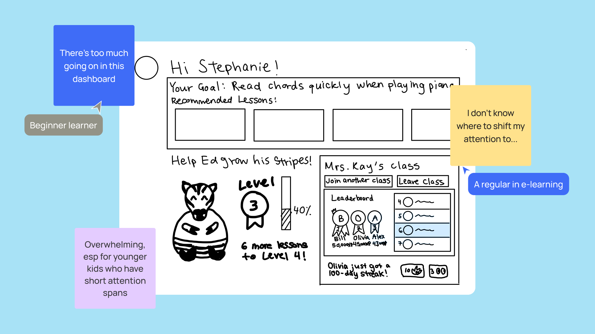
Would a dashboard redesign be sufficient for an effective learning experience?
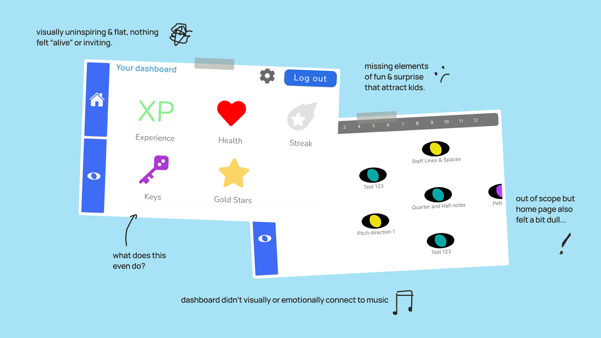
With more user feedback, I kept coming back to the same nagging question: is a dashboard redesign actually enough? We'd taken the brief at face value coming in, but something wasn't sitting right. A dashboard alone felt like too narrow a lens for what was ultimately a much deeper engagement problem...
It would get cluttered fast.
As evident from feedback, a single dashboard couldn't hold everything Noteful needed to offer.
A missed opportunity.
A fuller experience could set Noteful apart from competitors who weren't designing for younger audiences.
The bigger picture mattered.
Real, long-term engagement needs a complete and end-to-end learning experience.
After walking Noteful through our rationale, we got everyone aligned and shifted our focus — updating our problem statement to reflect what we now understood the real challenge to be.
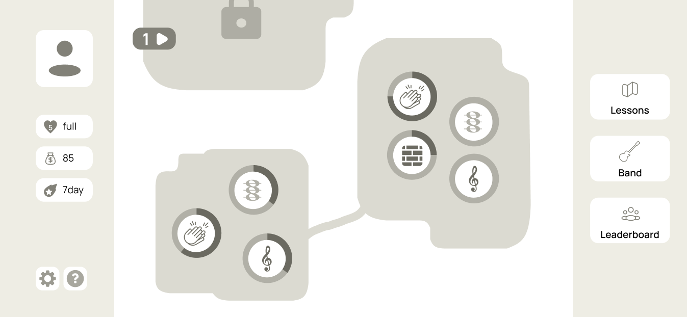
Designing a home for Noteful's learning experience.
With our scope redefined, the home screen was the natural place to start — it's the first thing a learner sees when they open the app, and it sets the tone for everything that follows. From there, I started exploring directions that could bring personality and playfulness to the experience while keeping things clear and easy to navigate.
Path view
The path view was a familiar view that was commonly found within level-based games, which felt the most straightforward.
However, this approach couldn’t capture all the layers of the curriculum, leaving behind the 'tiers'.
Island view
The island view provided a more fun approach that was unique, and it accurately represented the 4 layers of Noteful's curriculum.
I was initially worried about its unfamiliar concept to first-time users, but this was not found to be an issue during testing.
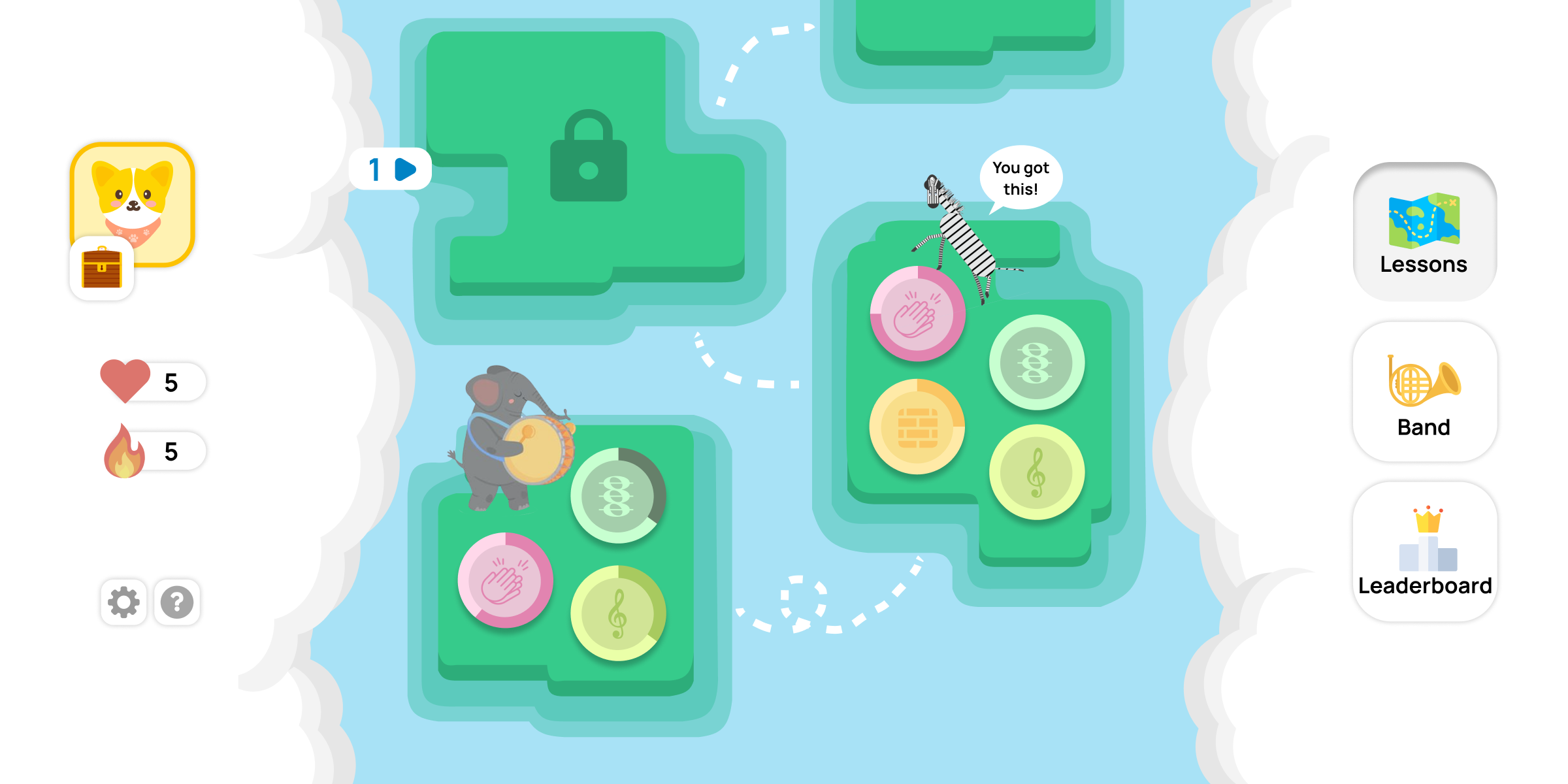
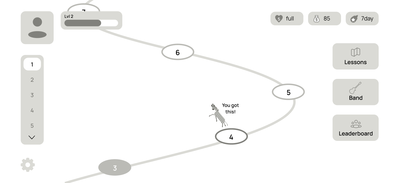
A fun, dynamic home page that serves as a central hub for learning features.
Choosing the island view came down to two things I wasn't willing to compromise on: it had to be fun, and it had to reflect the full complexity of Noteful's curriculum. That second part was harder than it sounds — the tiered structure meant a linear path just wouldn't cut it, no matter how polished it looked.
The island view was the only direction that could hold all of that without feeling cluttered or confusing. The fact that it also happened to feel the most distinctly Noteful made it an easy final call.
Levels
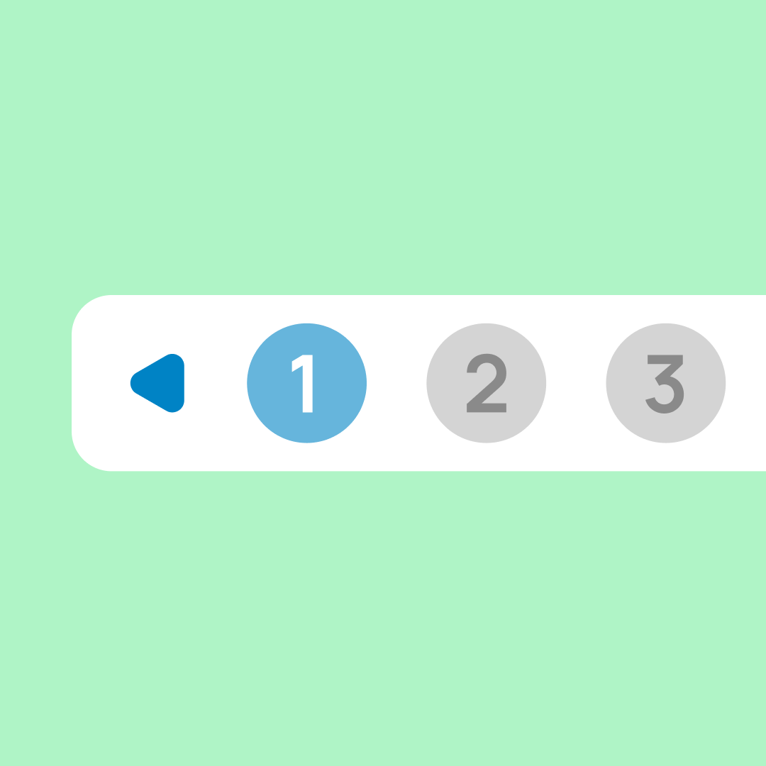
Expandable panel to toggle between levels

Tiers
One tier is represented by an entire island
Topics
Must start on all topics to unlock next tier
Lessons
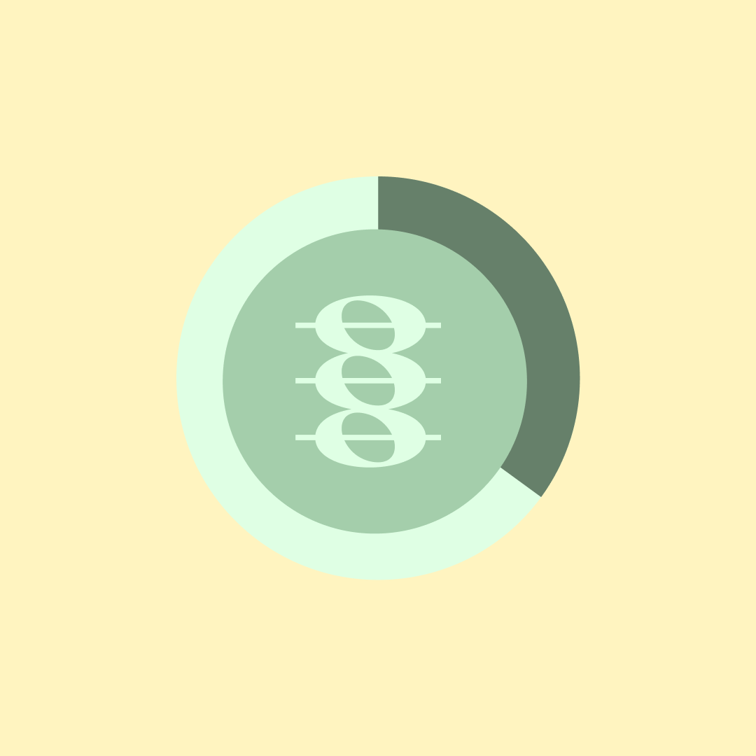
Progress bar reflects lessons til topic completion
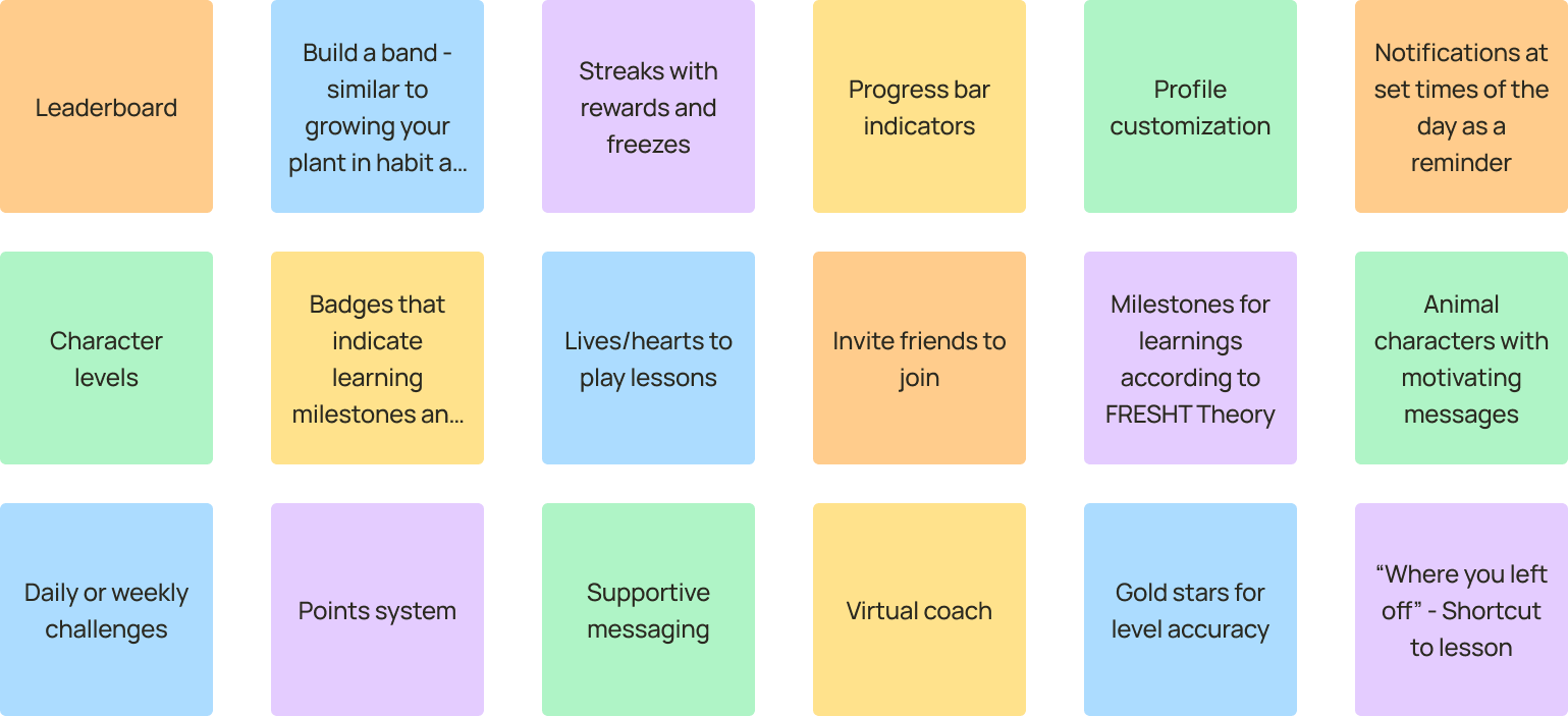
How can we target both extrinsic and intrinsic motivation?
Working with my teammates, we designed a set of features to enhance motivation on both fronts without cluttering the experience. We leaned on the Hook Model as a framework for building sustainable user habits, making sure each feature had a clear role in keeping learners engaged over time, not just in the moment.
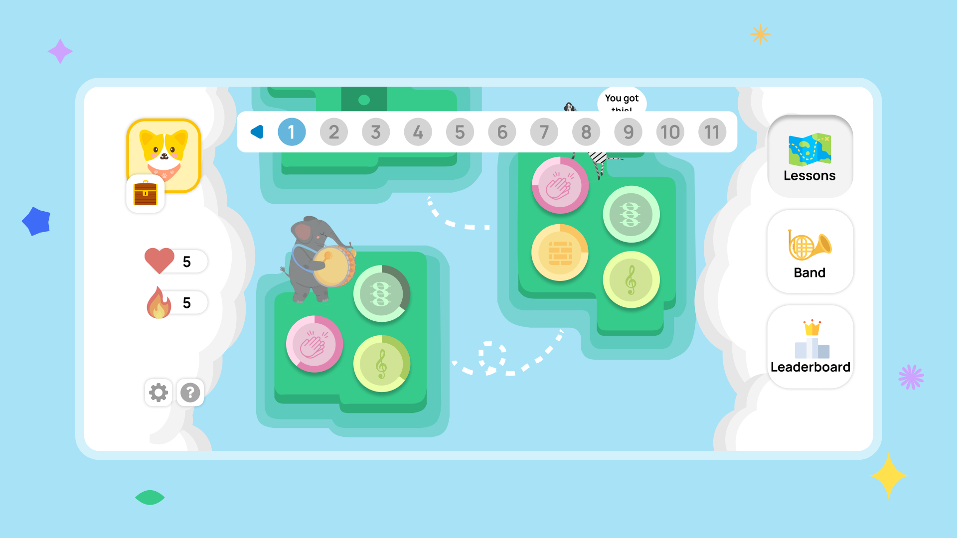
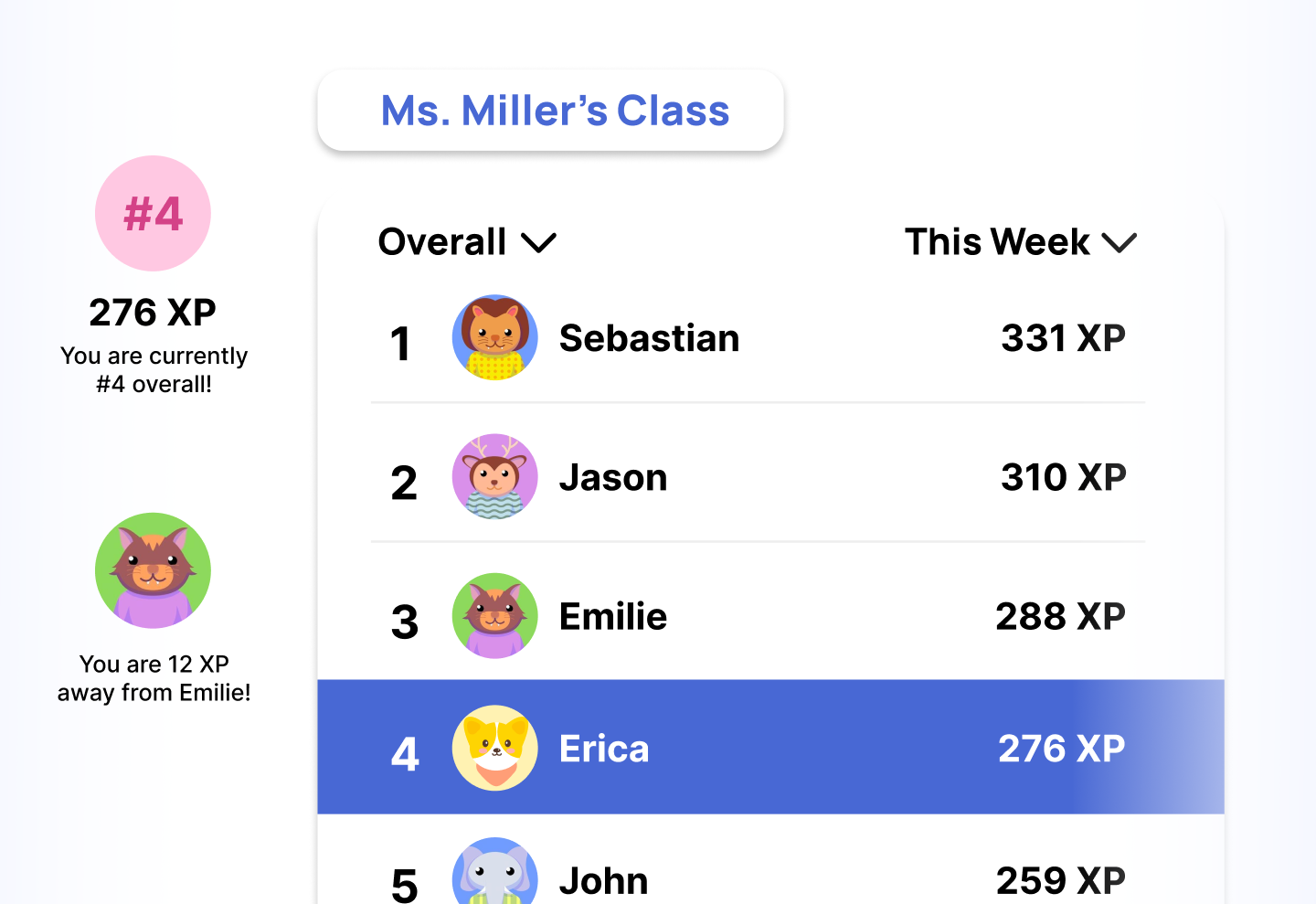
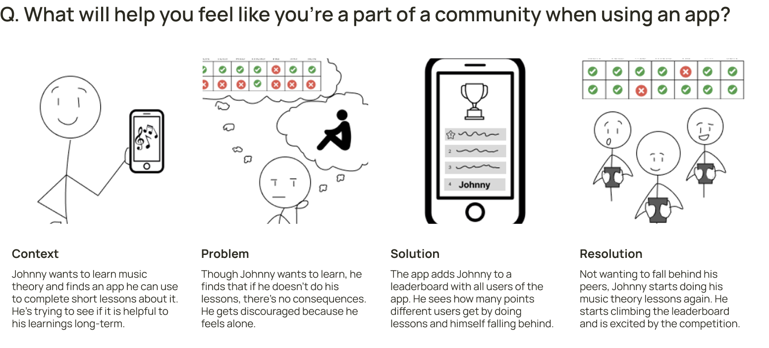
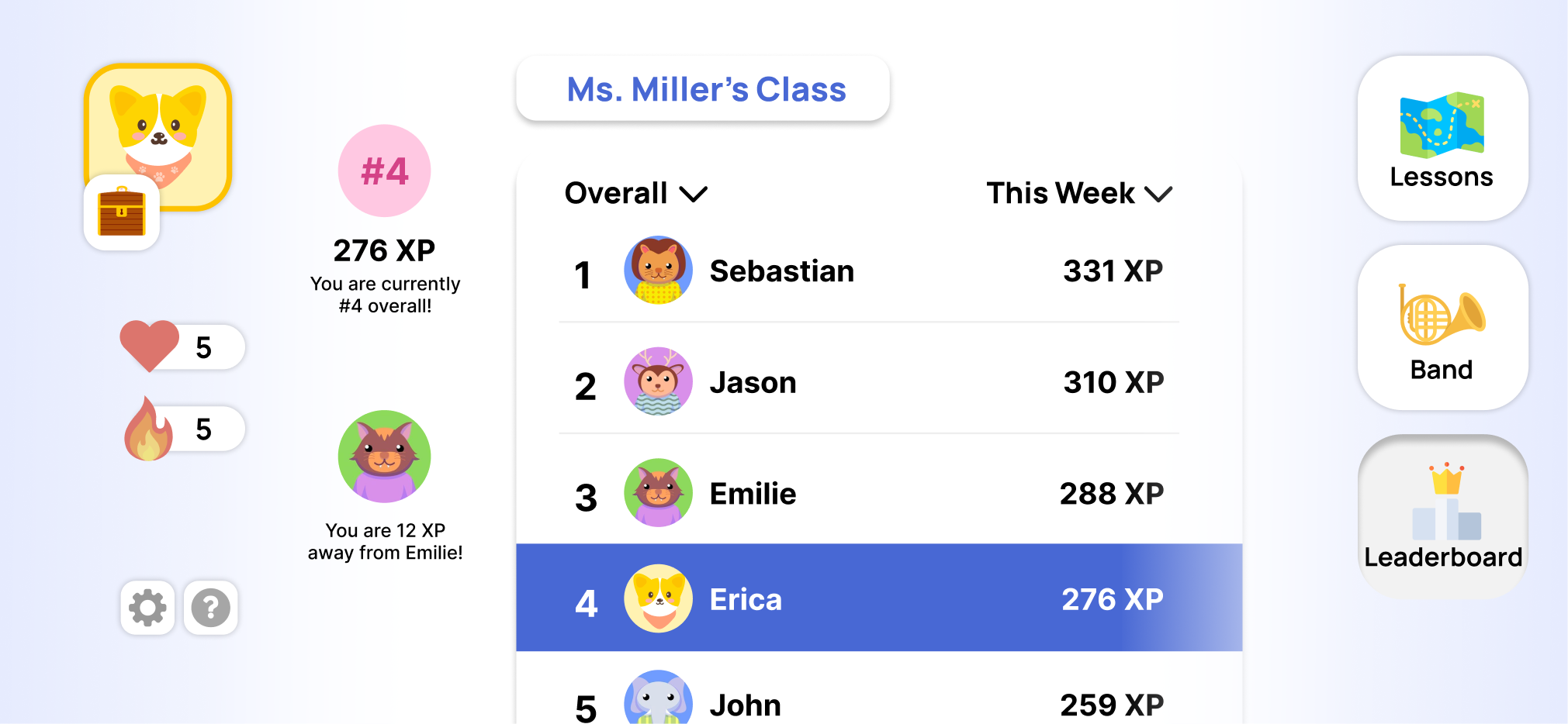
A leaderboard that makes learning social
Friendly competition goes a long way. The leaderboard taps into extrinsic motivation by giving learners something to work toward together — and in doing so, builds a sense of community within the app.
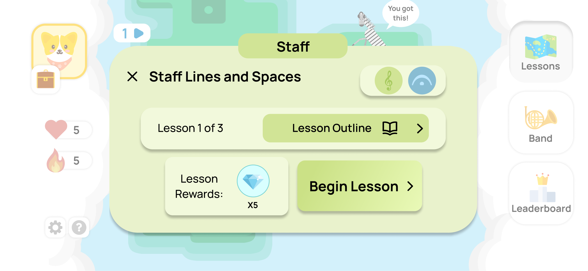
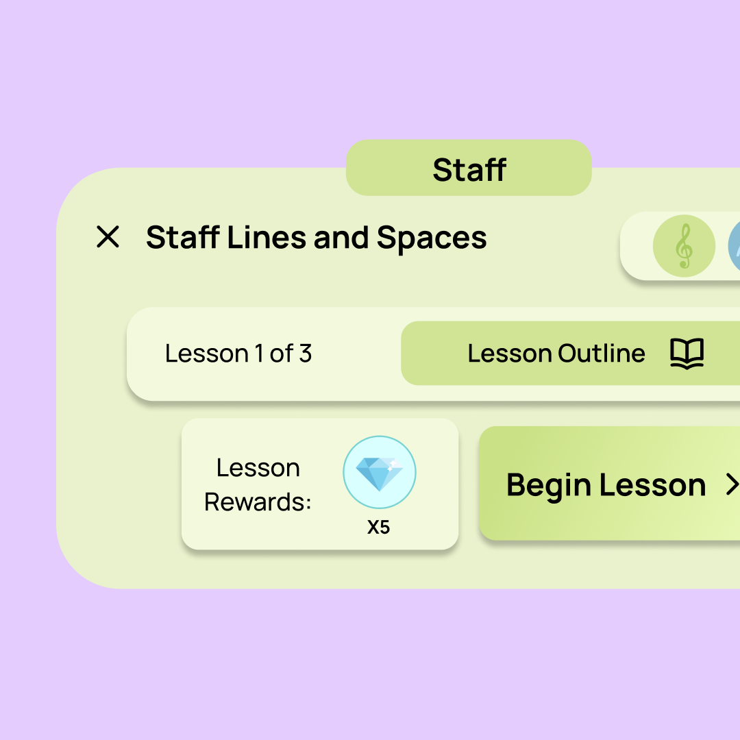
A lesson overview that gives meaning
Before diving in, users can see exactly what they're about to study. Knowing the "why" behind a lesson helps learners build a deeper connection to the material, a small addition that goes a long way toward intrinsic motivation.
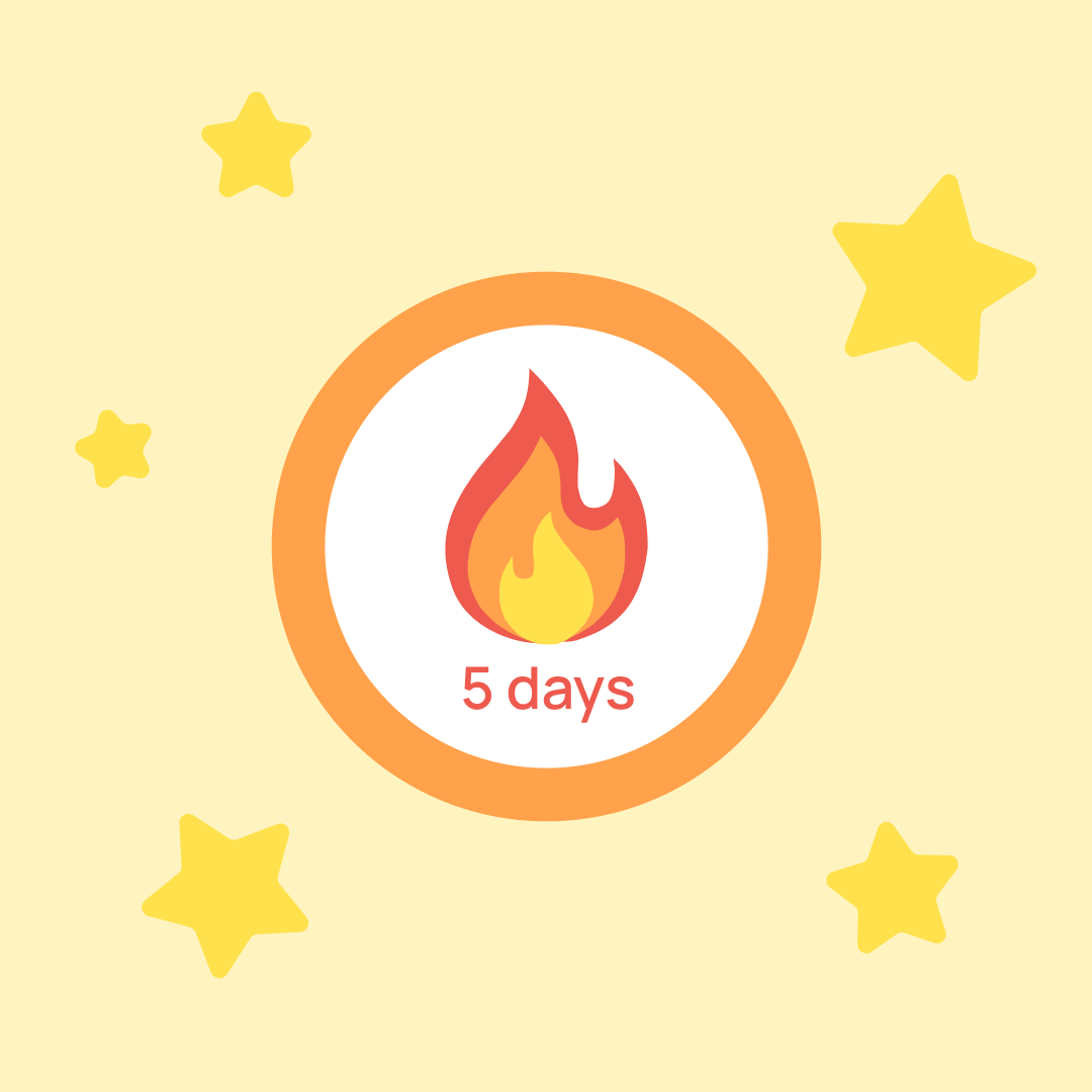
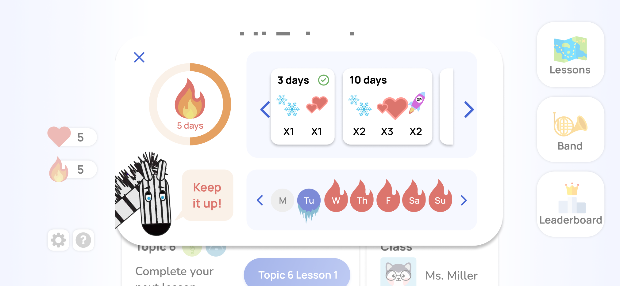
Streaks that reward showing up
Streaks are a familiar pattern for good reason. By surfacing weekly progress, offering positive reinforcement, and tying in rewards, we made consistency feel achievable and worth maintaining without adding friction to the experience.
How can we reduce redundancy to highlight high-impact features only?
"Badges" was a feature our client originally requested for milestone tracking, but as we dug deeper, it started to overlap with another concept that had emerged from testing: "Build a Band." Rather than keeping both, we took the time to evaluate them side by side.
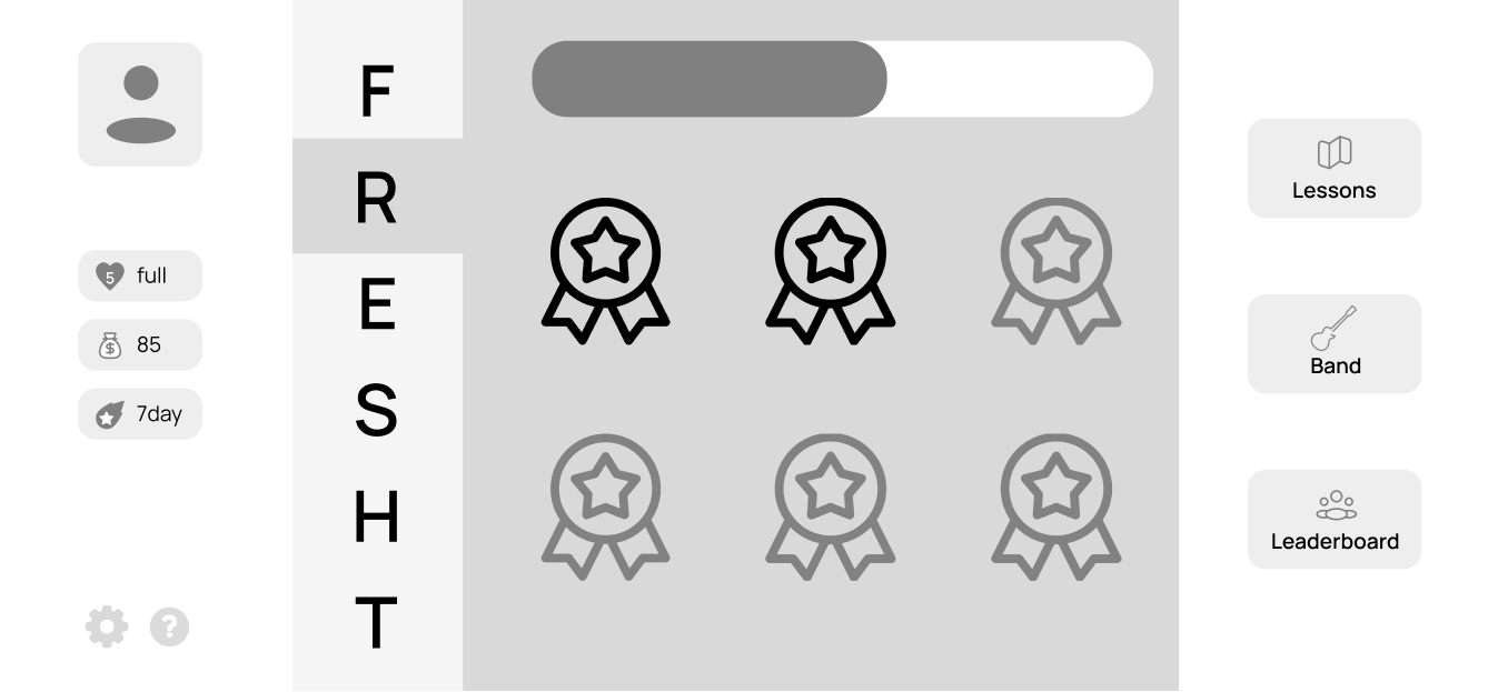
Collect badges
Badges were straightforward and easy to understand — progress felt directly tied to Noteful's curriculum.
But the ceiling for engagement was limited, and we worried it would end up incentivizing surface-level completion over genuine learning.
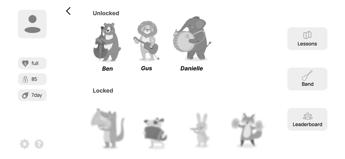
Build a band
This leaned into the musical aspect, making milestones feel distinctly on-brand. Users could build something that felt personally theirs, creating real emotional investment over time.
The tradeoff was complexity, requiring more engineering effort.
A unique way to demonstrate achievements.
In the end, Build a Band was the clearer choice. It aligned more closely with our design goals and Noteful's mission, and after looping in the development team to pressure-test the feasibility, we felt confident it would meaningfully elevate the experience, not just add to it.
Noteful agreed, and we landed on the decision to keep this feature in our prototype, with plans to introduce it as a post-MVP feature.
A fun and engaging music learning journey through gamification.
From the moment you open the app, learning feels like an adventure. The home screen drops you into your island, where you can jump into a lesson, track your progress, and pick up right where you left off.
Each lesson walks you through the material, checks your understanding, and sends you off with a clear sense of what you've learned and earned, making every session feel rewarding from start to finish.
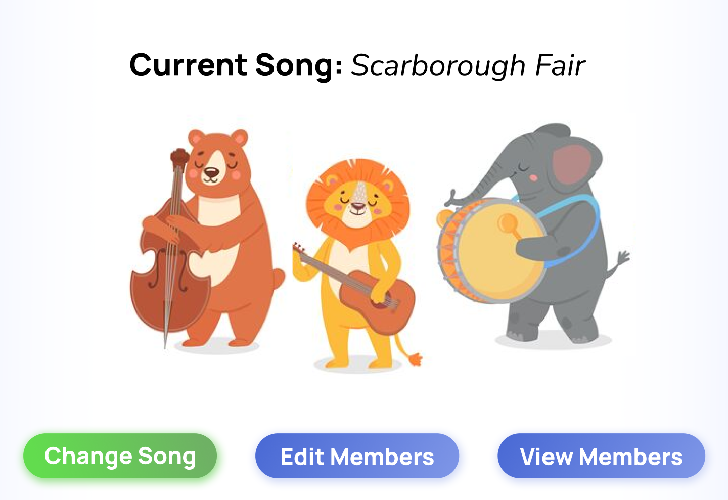
Hear learnings come to life and climb up the leaderboard.
As you progress through Noteful, you collect band members and unlock the songs they can play. Swap out members, mix and match your lineup, and build a band that feels uniquely yours.
And when you're ready to show it off, the leaderboard is right there, turning your progress into friendly competition with the community.
Different kinds of statistics to keep track of progress.
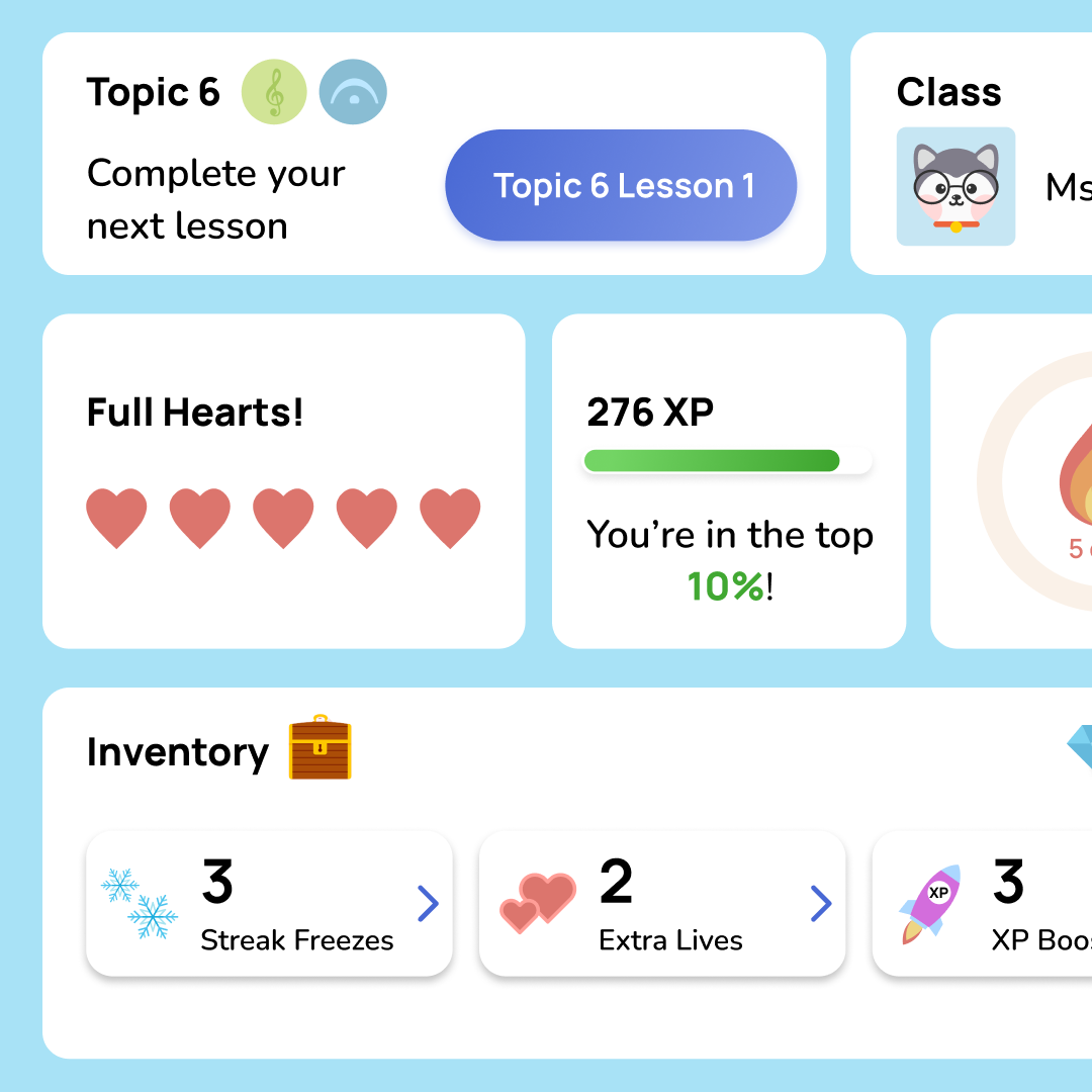
The profile page brings everything together. See your experience level, track your streak, browse your inventory, and check in on your class if you're part of one.
It's a personal snapshot of how far you've come, and (quietly) it's probably closer to what our client originally had in mind when they asked for a dashboard.
Above marks the design highlights for this project. Feel free to reach out at liwndy@gmail.com if you’d like to know more about my work at Noteful!
How can we measure success?
While our scope didn't extend to handoff, we documented our process thoroughly — delivering a prototype, implementation demo, final presentation, and report. I also took it a step further by thinking ahead to post-launch, identifying metrics we could track to measure success over time:
Adoption and reach
Number of new users captured in X weeks within launch.
Consistent learning
More than X% amount of students achieve a month long streak.
Classmate usage rate
Adoption from music teachers to use in their lessons.
And after presenting our final designs, we were glad to receive positive feedback from both the Noteful team and our peers :)
Design is a balancing act.
Dig for the problem!
Our original scope was a dashboard redesign — but had we taken that at face value, we would've built the wrong thing.
Asking "is this actually the root problem?" early on is what led us to a solution that could genuinely serve Noteful's users long-term. It's a question I want to make a habit.
Design should be intentional.
Best solutions come from being intentional, taking the time to think about which features truly matter and which don’t so we don't overcomplicate the experience.
I’ve come to see design as a balancing act: it only works when impact, clarity, and constraints all align.
And... what would I do differently?
Honestly? Build a design system from the start. At the time, I didn't fully understand what a design system was, and looking back at the designs now, the inconsistencies are hard to miss. It's a humbling reminder of how much I've grown since.
After working across multiple projects and building out design systems from the ground up, I now know that consistency is what makes a product feel cohesive, scalable, and trustworthy. Future me would've started there.