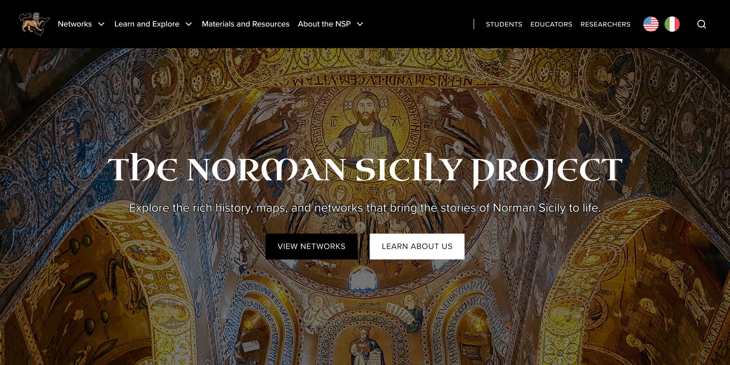
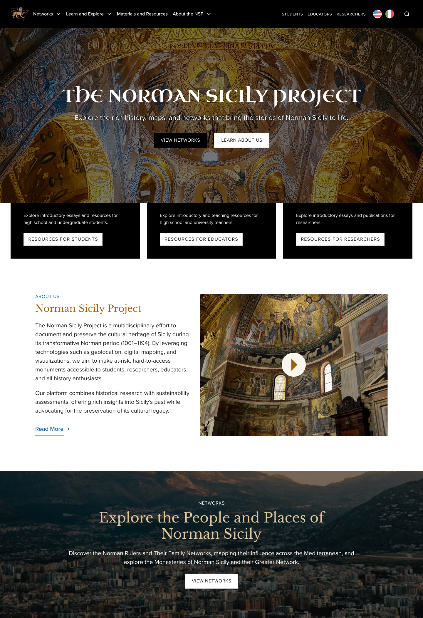
The Norman Sicily Project, a NEH-funded initiative, brings together an extensive collection of maps, photos, introductory essays, data, and more, making it both a research tool and an educational resource. Partnering with another designer, I revamped the website to bring clarity and usability to this wealth of information, ensuring that diverse audiences can easily explore Sicily's Norman past.
Problem
The NSP had a depth problem.
The Norman Sicily Project is a rich historical archive, home to an extensive collection of documents, artifacts, and scholarship on 12th-century Norman Sicily. The knowledge was all there, but for most readers, it was nearly impossible to explore meaningfully.
The experience was dense, offered little guidance, and visually, the site felt flat and utilitarian — a far cry from the color, vibrancy, and cultural richness of the world it was trying to bring to life.
This disconnect between content and presentation made the history feel distant instead of engaging.
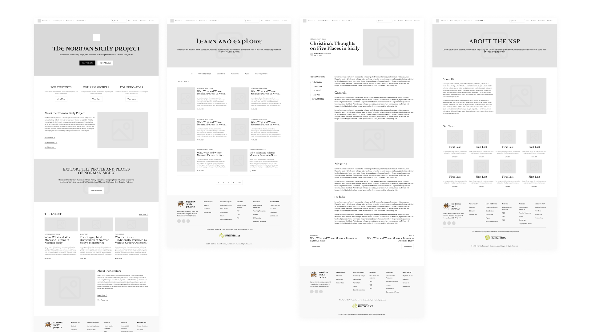
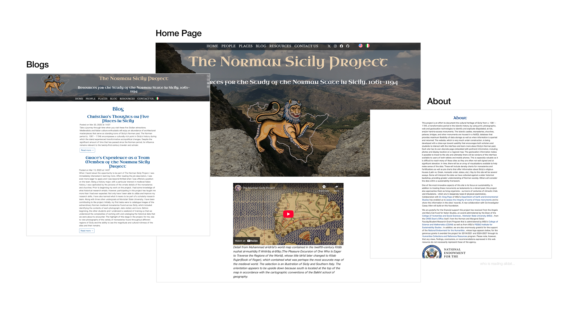 Old Website
So we set out to change that.
Over four months, our team reimagined the site from the ground up, rethinking its structure, navigation, and visual identity across three key areas:
Information Architecture
Clarifying content groupings and establishing meaningful entry points across the site.
Interaction Design
Creating consistent layouts and visual hierarchy to reduce cognitive load.
Website Accessibility
Improving site accessibility to support extended reading and diverse audiences.
Solution
A clear and visually engaging platform that celebrates Norman Sicily’s rich culture.
Kickoff
An experience accessible to scholars, teachers, and learners alike.
After our first conversations with the project leads, one thing became clear: this wasn't a site built for a single type of user. The NSP needed to work for scholars diving deep into primary sources, teachers building curricula, and curious learners encountering Norman Sicily for the very first time. Each audience comes in with different goals and levels of expertise.
Together with the team, we defined 3 primary audiences to anchor every decision that followed.
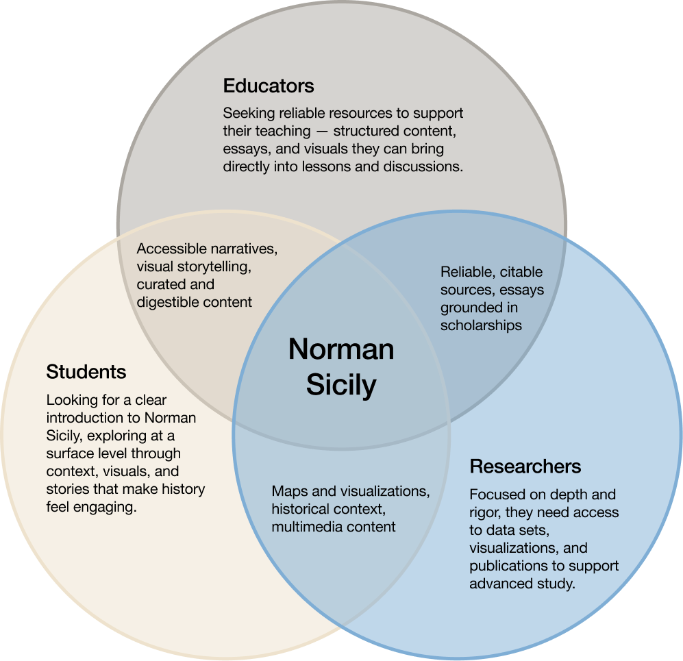
Rather than designing for an “ideal” user, we aimed to create a flexible experience that could accommodate quick exploration, deep research, and guided learning alike.
Information Architecture
Assessing existing design decisions.
We started by reviewing the work of designers before us. More specifically, we looked at their information architecture, their low-fidelity wireframes, and the decisions that had shaped the site up to this point. This helped us understand where the project was headed, and more importantly, where there were opportunities to better align the structure with what the NSP actually needed to be.
What we found.
Unclear labels
Navigation labels were vague and inconsistent, leaving users unsure of where to find information.
Disconnected structure
The site's organization reflected how content was added over time — not how users actually think.
Irrelevant pages
Pages were added without a clear sense of who they were for or how they fit into the experience.
Underneath it all, the structure didn't account for the site's range of use cases: quick exploration, classroom teaching, in-depth research.
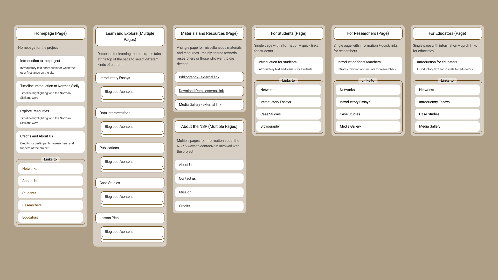
Our new IA laid the groundwork for a clearer, more intuitive system that supports discovery across user groups.
The result is an architecture that reflects how people actually move through it, whether they're browsing casually or researching in depth.
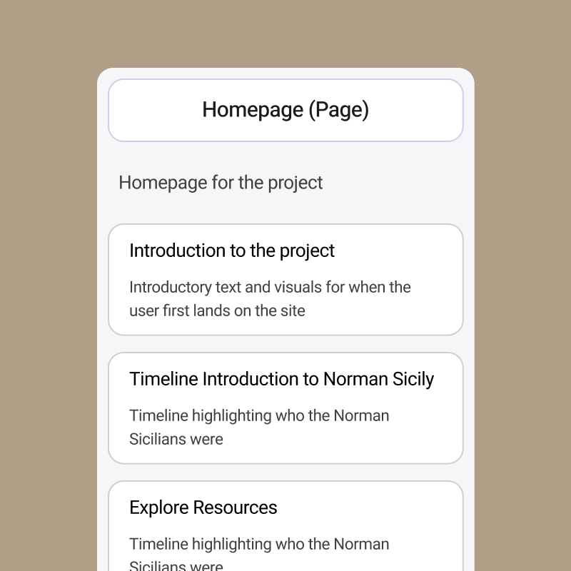
Prototype
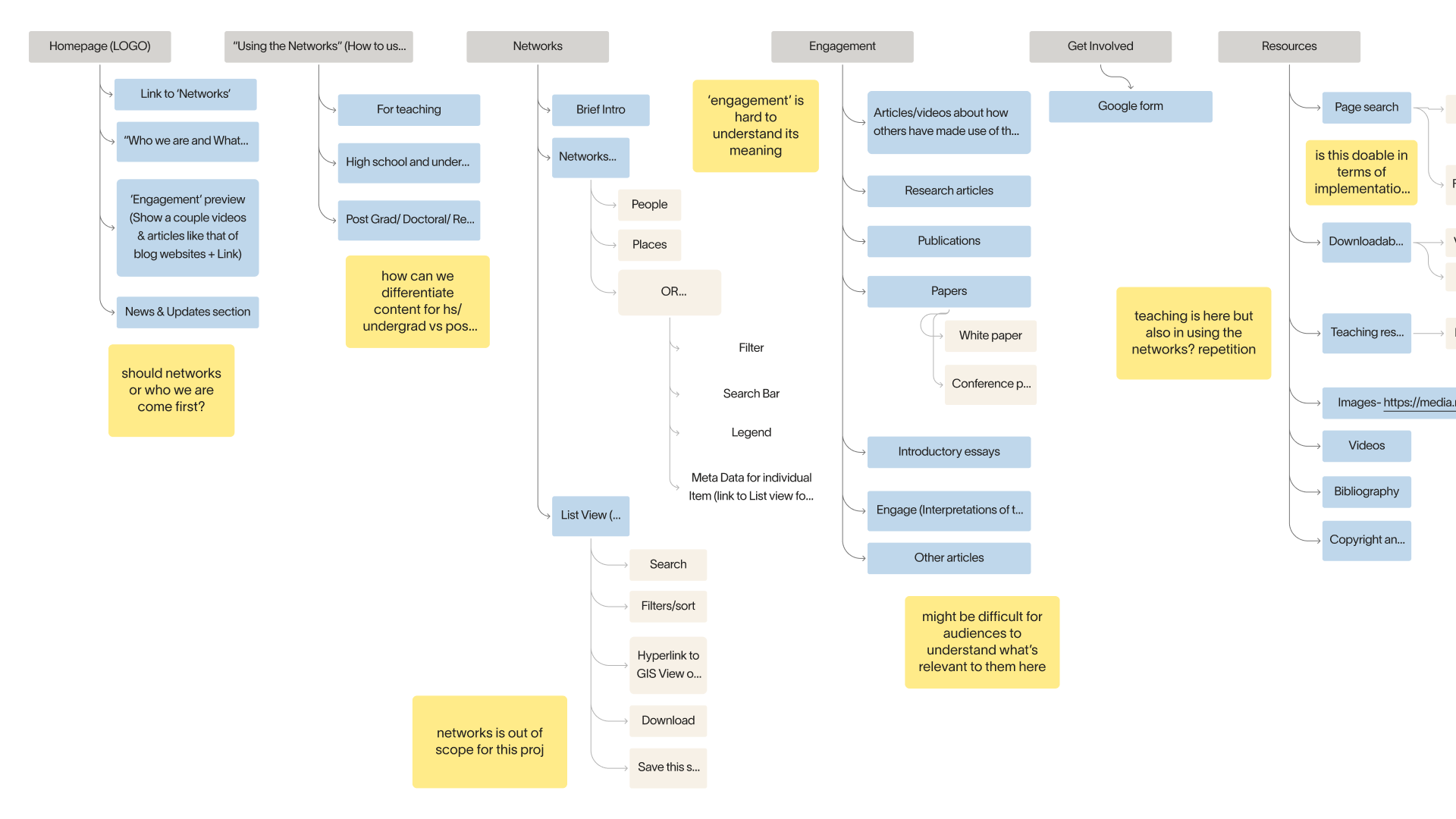
With a clearer structure in place, we moved into early wireframes.
Low-fidelity explorations gave us a way to quickly test layouts and think through how different types of content could coexist on the same page. At this stage, the focus was on clarity and function — making sure the foundation we'd built in the IA phase could actually hold up across the site's diverse needs before we moved into visual design.
Design System
A visual identity rooted in culture, built for credibility.
Through conversations with the client, we landed on a direction that balanced two things that can sometimes feel at odds: vibrancy and trustworthiness. The design needed to reflect the richness of Norman Sicily's culture while still feeling appropriate for an institutional, academically-oriented context.
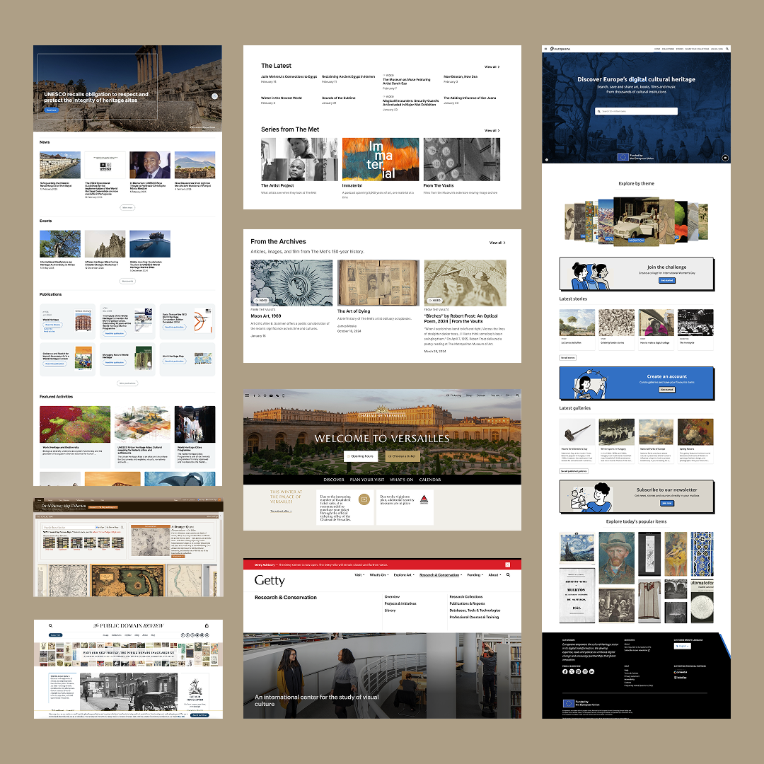
Landscape Audit
Drawing from other cultural heritage sites, we gathered inspiration across visual and content, using them to inform a design that could speak to a wide audience without sacrificing credibility.
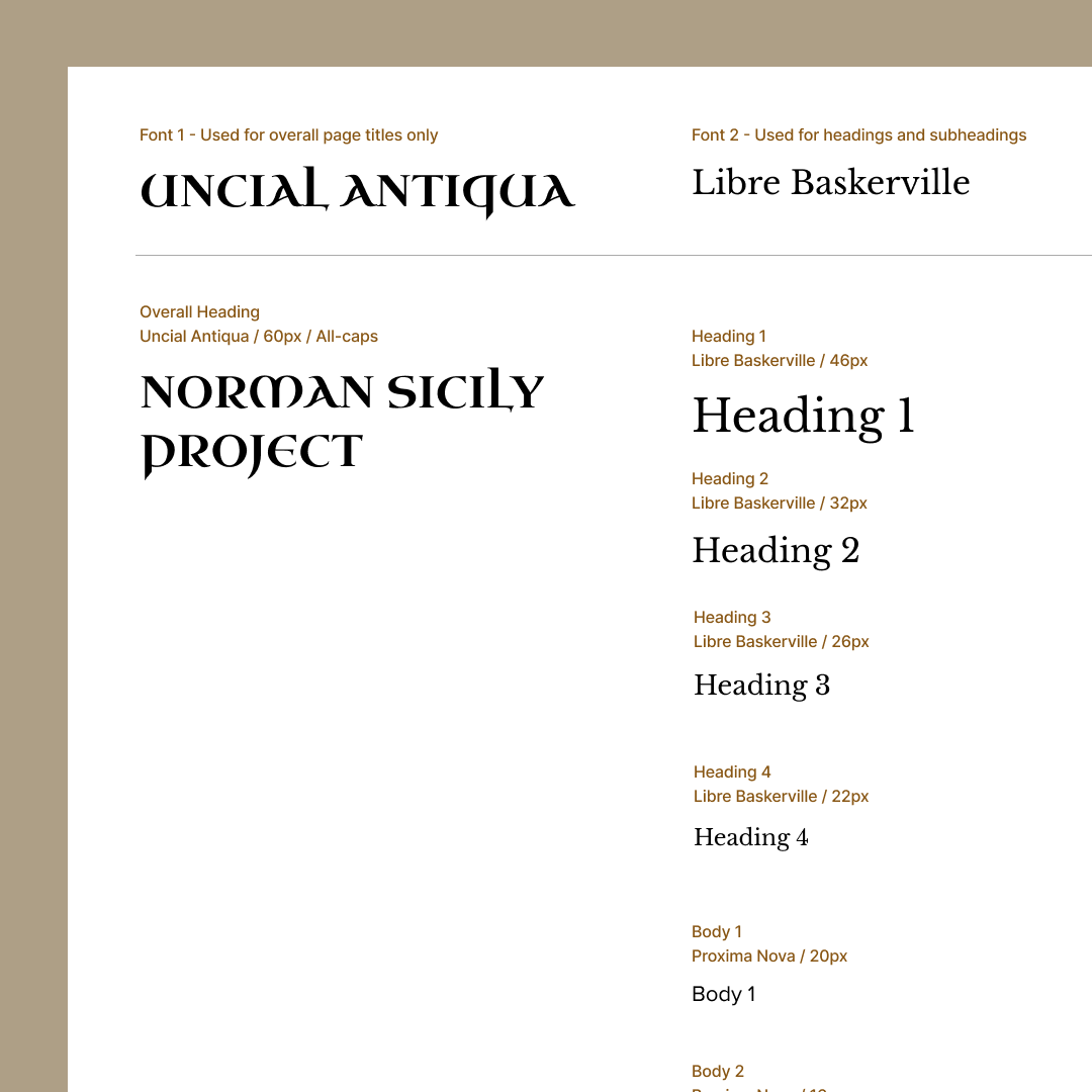
Design System
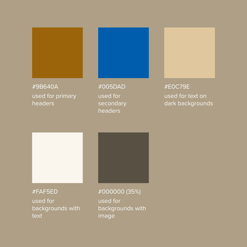
From there, we built out our own style guide encompassing a color palette, typography, and library of reusable components, giving us and engineers a consistent foundation to work from.
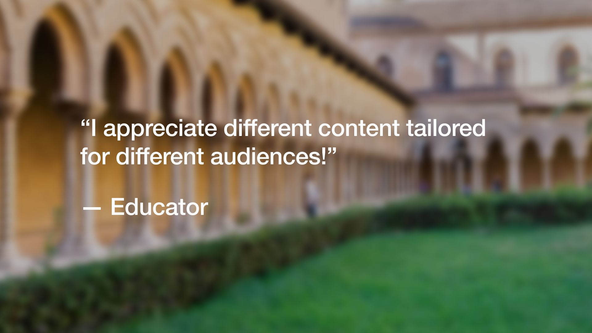
To validate our decisions, we brought in our target audience.
We ran task-based usability testing with six participants — two from each of our three target audiences — with tasks designed to surface issues around navigation clarity, content findability, visual design, and overall usability. The most consistent theme that emerged was UX writing: users repeatedly flagged areas where navigation labels and wording felt unclear or harder to parse than it needed to be.
Admittedly, UX writing was not my strongest suit... nothing humbles you faster than watching a user pause at a label you wrote.
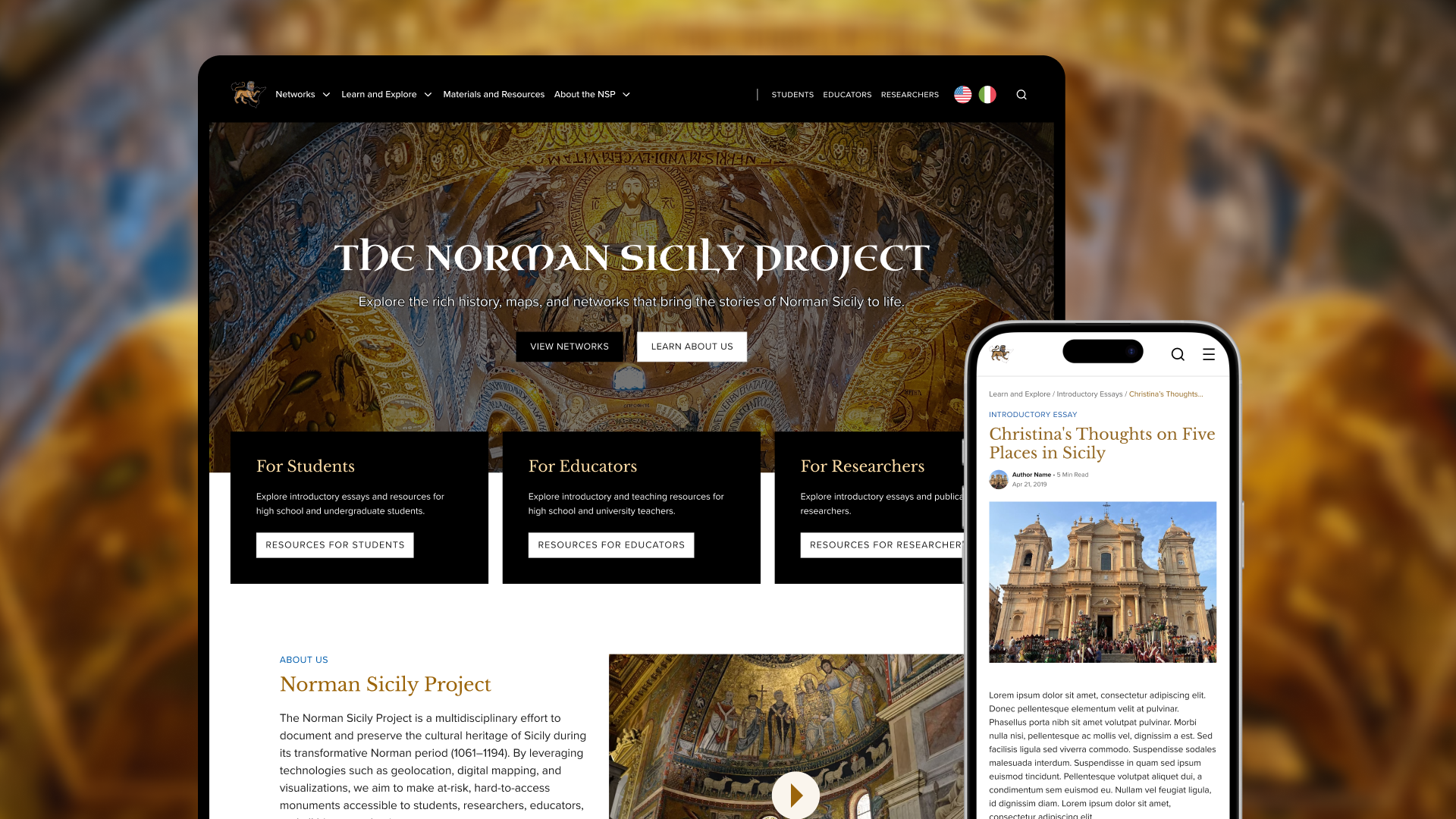
A redesigned experience that makes Norman Sicily's culture explorable for all.
An entrance point for every audience.
Through navigation, tailored pathways, and language, we ensure users can confidently explore the site, whether you're looking for a deep dive or general information.
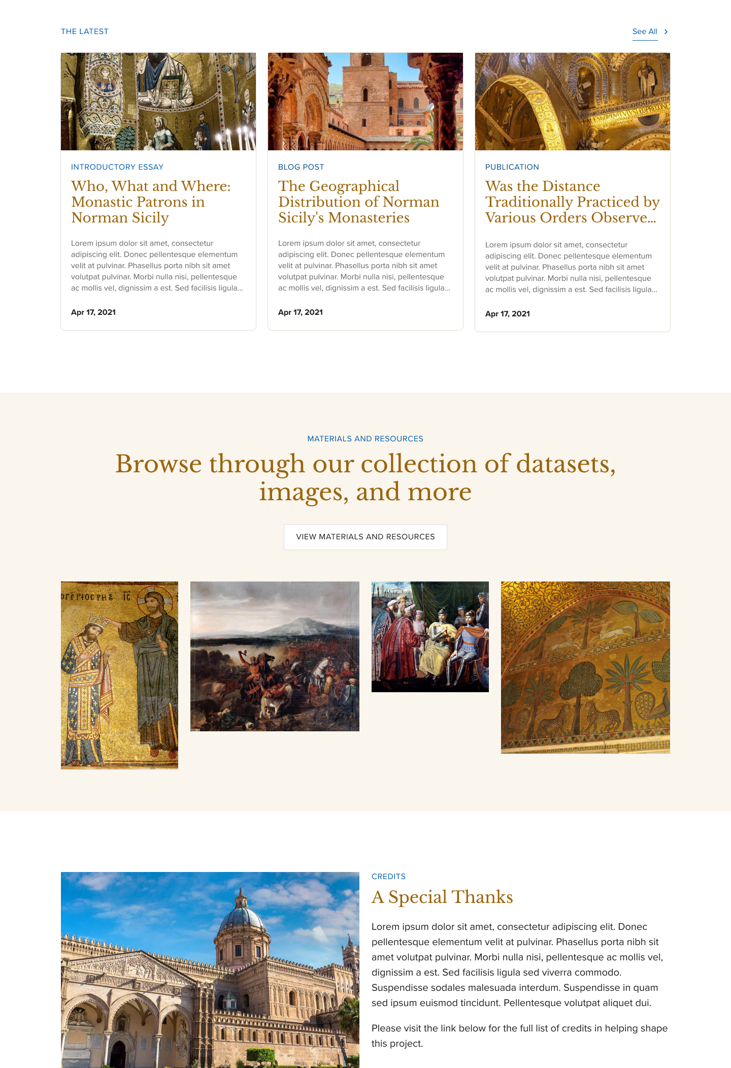
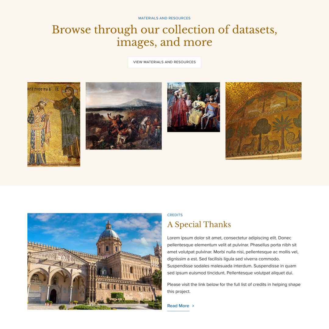
Showcases everything at a glance.
From the latest posts to quick links for browsing resources and exploring the map, the homepage surfaces key content, encouraging users to dive deeper without feeling lost.
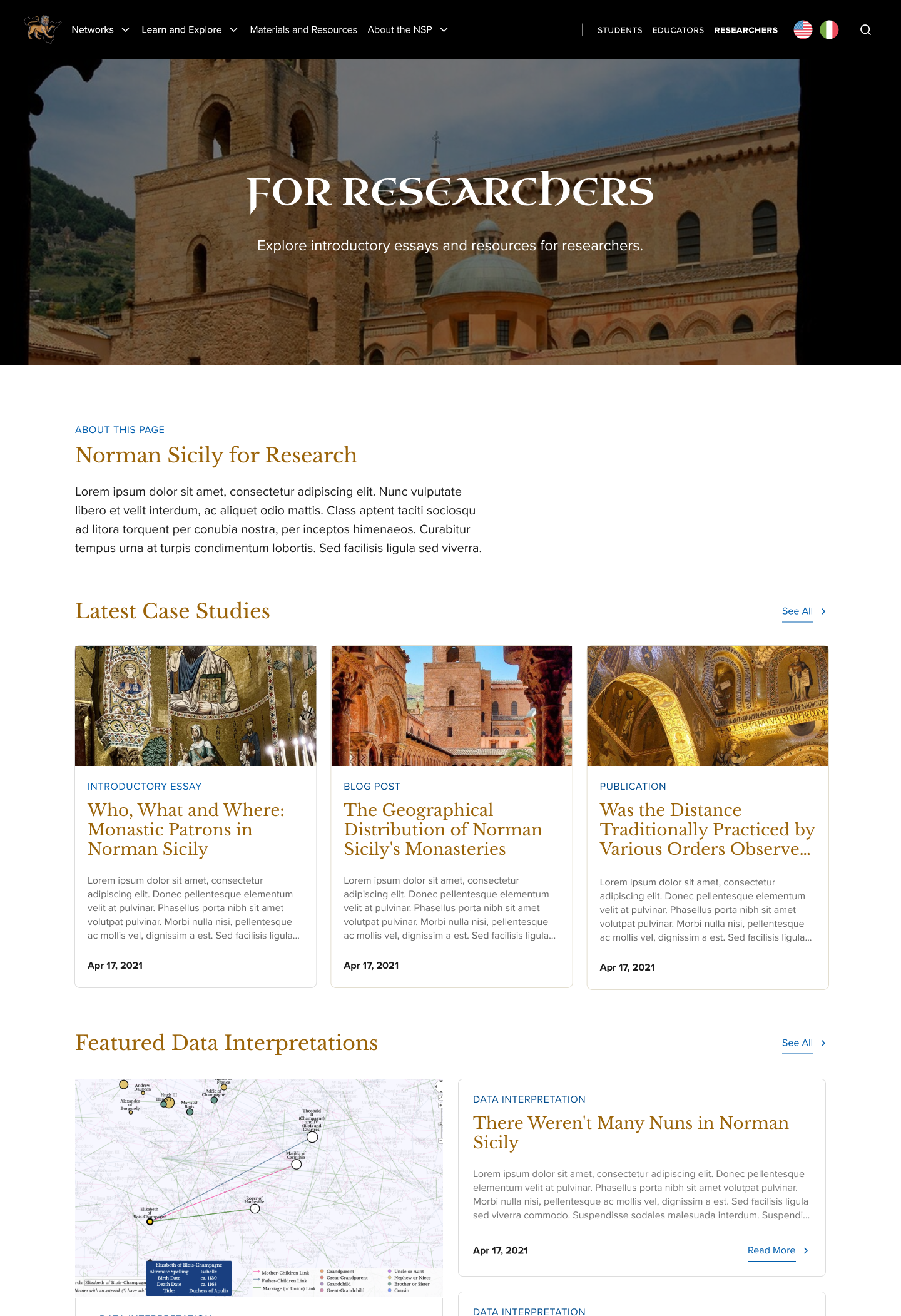
Dedicated resource pages for every audience.
We created tailored pages for each audience. For example, researchers have Data Interpretations, while students and educators are guided toward resources most relevant to them.
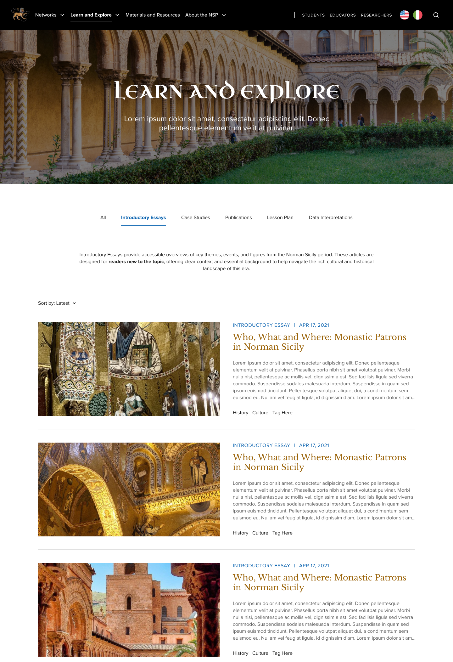
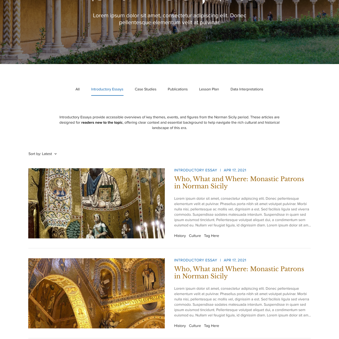
Centralized knowledge in one place.
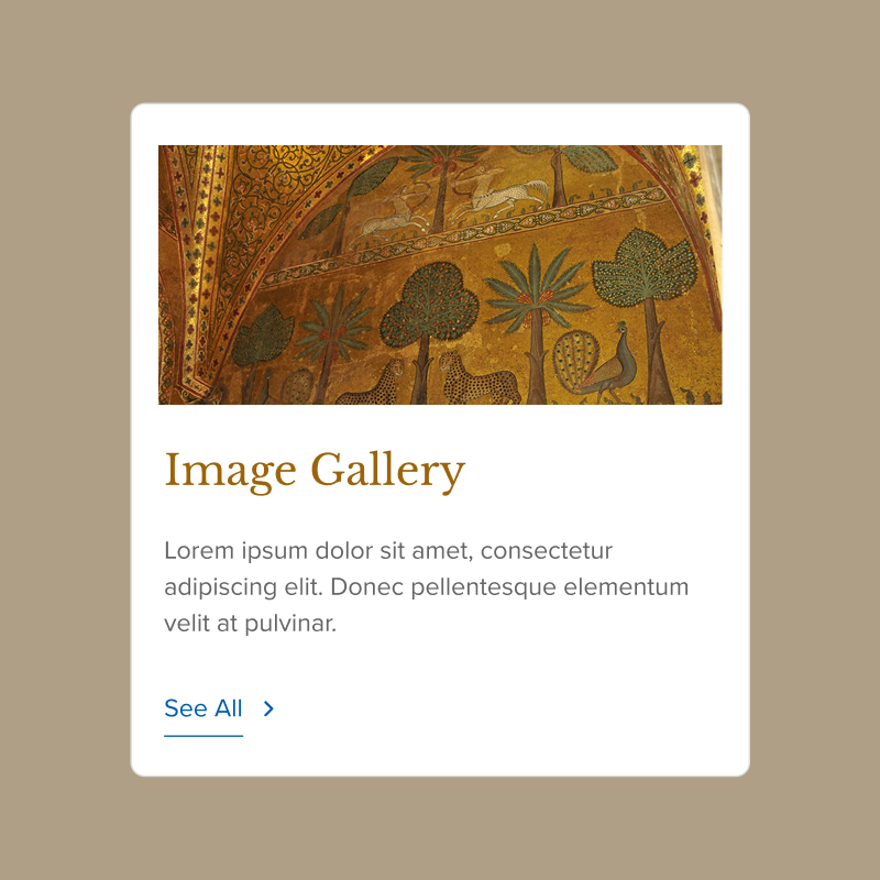
We brought all articles into one hub. With filters and short introductions for each type, users can easily find text to match their level of familiarity and purpose for exploring the abundant information.
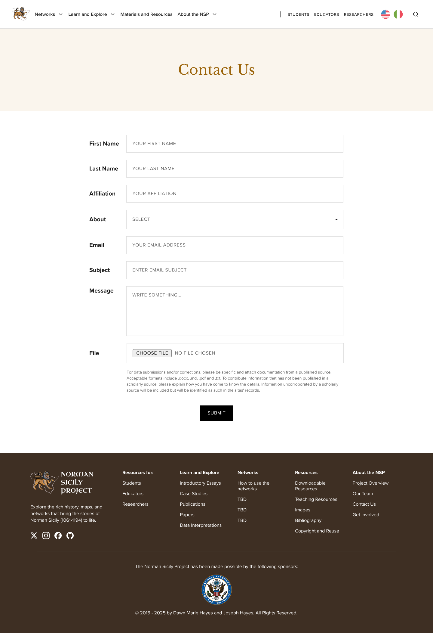
An easy way to get in touch.
We designed a simple, accessible contact page that makes it effortless for users to reach out, whether they have questions, want to collaborate, or are looking for more information about the project.
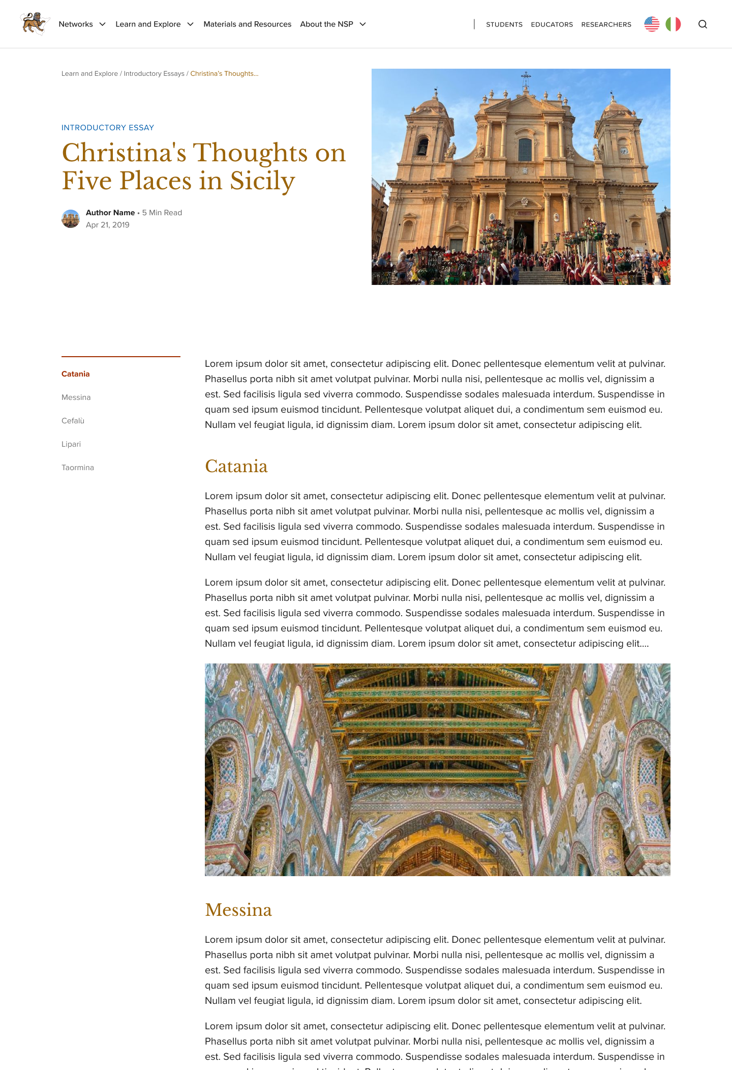
Making posts easier to digest.
Long-form articles can be daunting, so we introduced a sticky left-hand menu with a table of contents. This lets users skim, jump between sections, and get a sense of the article at a glance.
Above marks six design highlights completed for this project. Feel free to reach out at liwndy@gmail.com if you’d like to know more about my work at the NSP!
The best designs work from the inside out.
Content & visual go hand in hand.
The way information is structured and written is as important how it’s presented. A clean layout can only take you so far if labels are confusing and text is dense.
Working on both in tandem is what made the final experience feel cohesive and genuinely approachable.
Design is a system, not a surface.
I approached it as a systems problem — who are the users, how do they think, what do they need, and how does the visual language support all of that?
That end-to-end thinking is what I want to bring to every project I work on.